Estimated reading time: 3 minutes
When Bill and Matt, the founders of the successful Denver-based architecture firm Sprocket, approached us with their plan to refresh their website and transition away from a standard marketing website, we were intrigued. The company was already successful enough; they didn’t need to utilize traditional marketing techniques to recruit customers, and they didn’t want to be another standard stale portfolio site that is so common amongst architecture firms.
Instead, they wanted something that represented their journey and Sprocket’s story. We realized this would be a fun project that would allow our creativity to shine — although we anticipated that since our clients were architects, they would have firm opinions on design themselves (which they did). And as usual, the budget for a website refresh was limited which meant we had to be even more creative.
The Ask from Sprocket:
- No standard, stale portfolio images
- No traditional marketing strategies
- Represent the company and founders’ story through time
- Visually striking, creative design, and fun feel
- Limited budget
The Plan from Visual Foundry
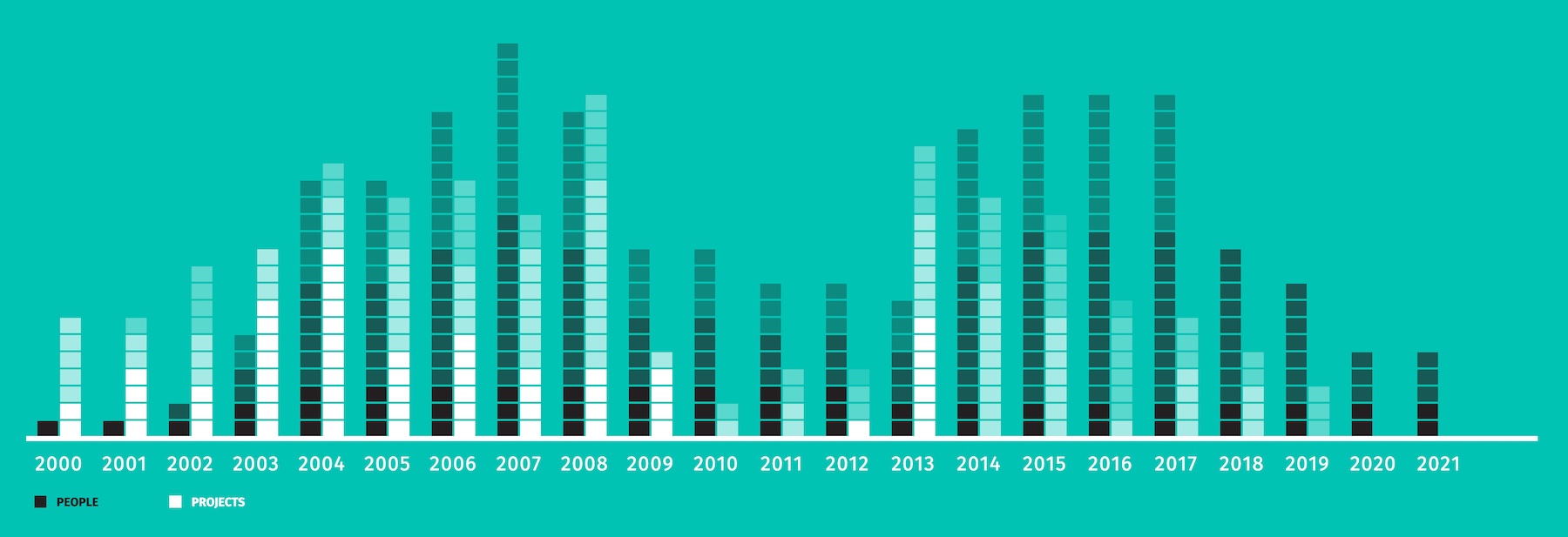
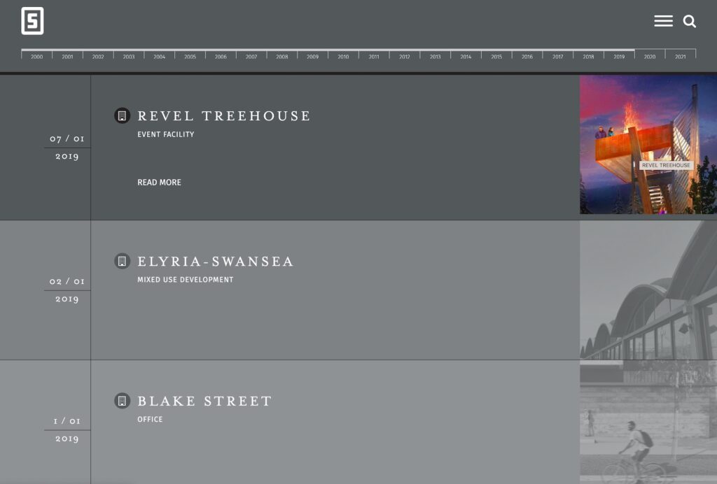
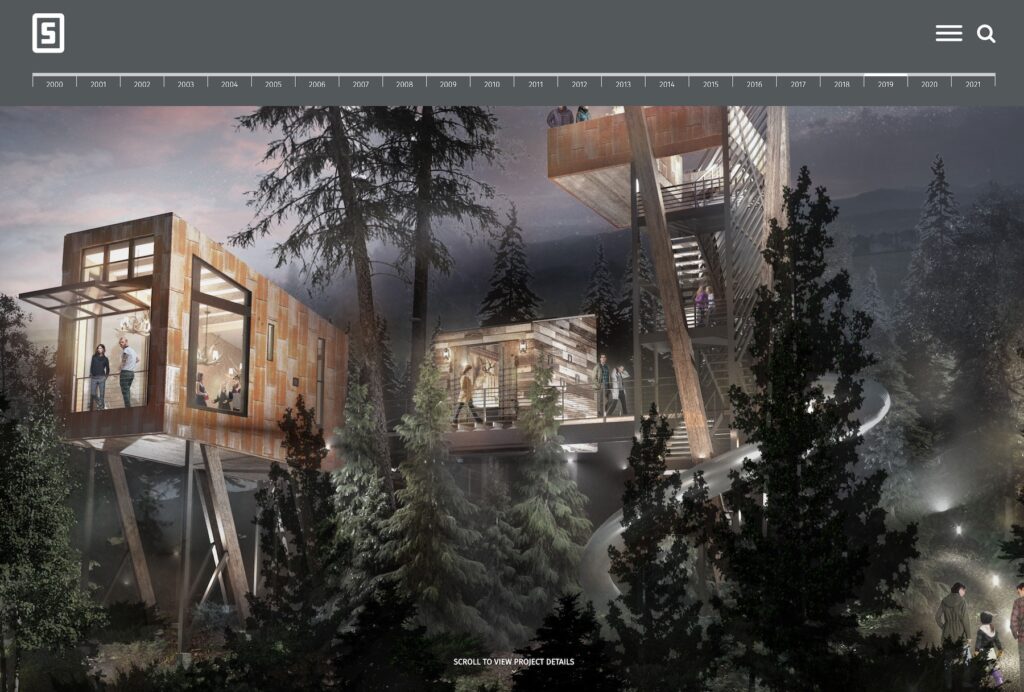
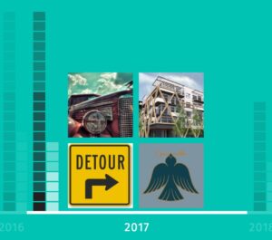
The basic premise started with a timeline showing events and Sprocket milestones linked. From there the brief was to keep it highly visual, and the clients emphasized a desire for creative design and navigation. Of course, details about projects were also important, and they requested the site show the ebbs and flows of the company in terms of projects and employees. It was a lot to take on in one pass!
Russell, our head designer, approached the project from two angles: the landing page and its functionality, and the timeline and its functionality. After several passes with the customer, the basic premise of these two components took shape, and Russell switched to the mechanics of a project page.
Unsurprisingly for an architecture firm, color was and is very important to Sprocket. Mid-project Sprocket rebranded, which brought changes to the logo and the brand colors which we randomized as backgrounds on the home page. Furthermore, the use of near monochrome colors in the timeline view further amplifies color on hover and for the photography.
The finished product is a visually striking interactive homepage that gives viewers an at-a-glance look at the company’s growth and projects. Sprocket seemed very pleased with the result and set about populating the data into the site to get it to how it looks today. Take a look at the site (https://sprocket-dp.com) and let us know what you think!